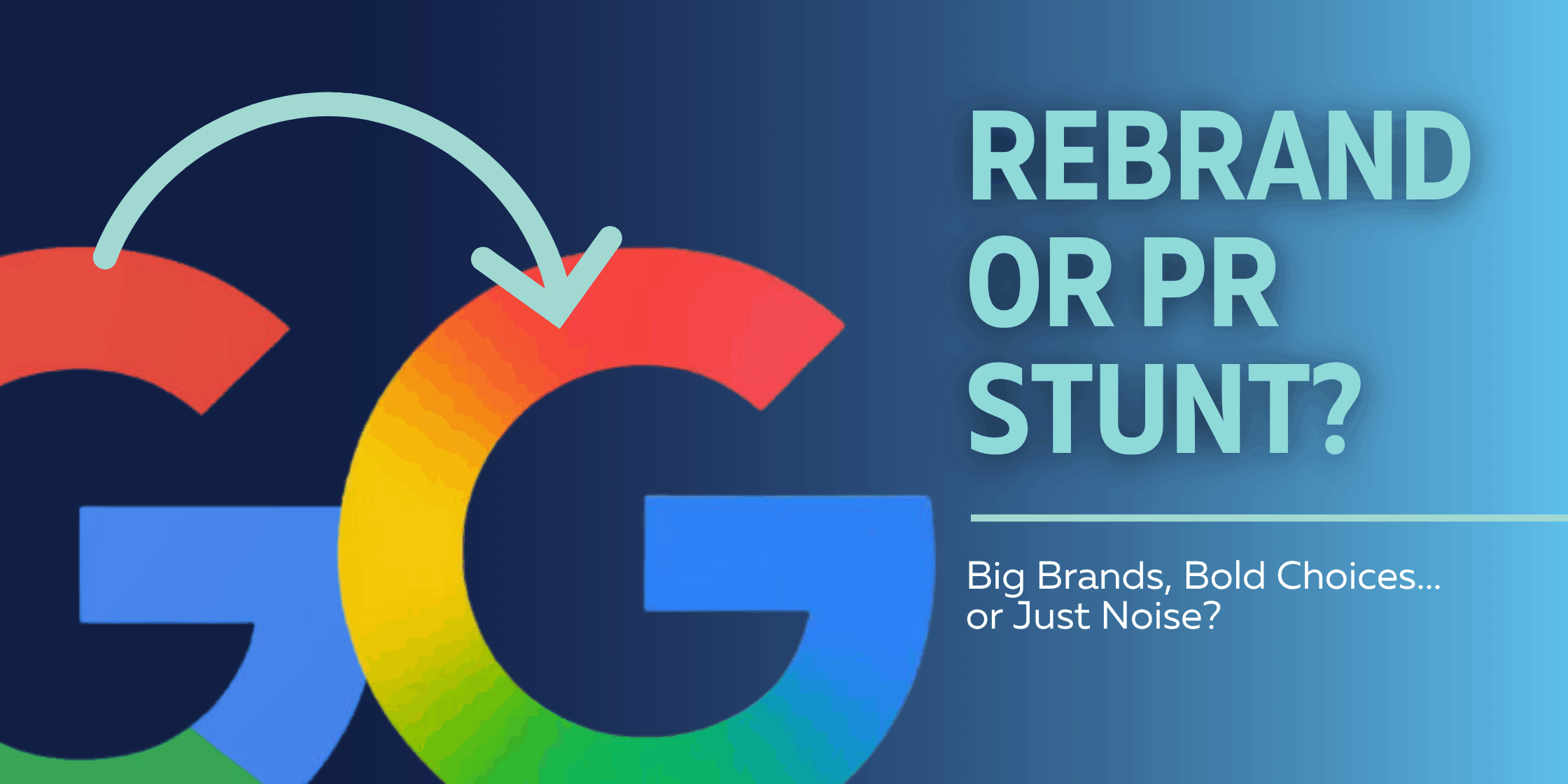
If it feels like every major brand has dropped a new logo lately! Google, Walmart, HBO Max (or just “Max”), and Jaguar have all rolled out identity updates over the past few months. Some are clean refreshes. Others? Well, let’s just say the design community has thoughts.
So… are these strategic creative decisions? Or just expensive PR stunts disguised as design?
Google’s Gradient Glow-Up
Google’s logo update was subtle—just refined letterforms and smoother color transitions. The update aligns with their “Material You” design system and looks great on digital screens.
But here’s the con: the gradient they used might be sleek for UX—but it’s a pain to reproduce in real-world formats. Embroidery, single-color printing, engraving—gradients often don’t hold up well across mediums. Sure, Google doesn’t need polos or signage the way small businesses do, but it’s a key consideration when designing logos for brands without Google’s digital-only reach.
Expert Take: Designer Allan Peters notes that gradients can be a trap: “They’re trendy, but often short-lived—and difficult to execute well across all formats.”
Check out Allan Peter’s thoughts.
Walmart’s Quietly Loud Rebrand
Walmart spent millions to make very minor visual updates: slightly darker blue, slightly bolder font, a tighter spark icon. The end result? Familiar, clean… and almost too subtle.
It’s a move that sparked more memes than design praise—but maybe that was the point. Was this really about logo refinement? Or was it a conversation-starting campaign cleverly disguised as a rebrand?
Expert Take: Peters praised the typography tweaks and modernized look, calling it “timeless.” But even he hinted that the changes could have been handled with far less fanfare—and budget.
Jaguar: Speed Meets Identity Crisis
Jaguar’s rebrand ditched the iconic leaping cat in favor of a hyper-minimalist wordmark—mixing uppercase and lowercase letters (yes, that little “g” is intentional) with bold spacing.
While the brand claimed it’s a move toward electric luxury, the design feels cold and a little generic. It’s a sharp turn from the prestige and energy the leaping jag once represented.
Expert Take: Allan Peters stepped in with a reimagined version – fixing the kerning, restoring elegance, and reviving the emotional resonance.
Check out his reimagined version.
Are Logo Refreshes Worth the Price Tag?
For companies like Walmart and Jaguar, rebrands cost millions. Between strategy, design, rollout, and messaging, the spend adds up fast. But the return on investment isn’t always immediate – it’s about staying relevant and future-ready.
For smaller businesses, that’s where strategy becomes crucial. A smart refresh should:
- Reflect where your brand is going
- Be flexible across platforms
- Build (not abandon) your equity
Final Thoughts
Some brands evolve and some just chase the trend cycle. Either way, one thing’s clear: people notice – even if they don’t love it.
Is Your Logo Ready for a Refresh?
At Flourish, we help brands evolve intentionally without losing what makes them stand out. Whether you need a full rebrand or a light polish, we’re here to help you make a strategic, stylish move.

