When you think of a brand, the first thing that usually comes to mind is its logo. However, did you know there are seven variations of logos? You may not realize it, but you’ve probably seen all seven types in one way or another. Logos represent your brand, your personality, and if done right, is one of the most memorable components of your business.
Are you thinking about refreshing your brand? Maybe you’re exploring a new business venture and you’re brainstorming logo ideas. Regardless of the reason, it’s helpful to explore which logo type is right for you. Each style has its own benefits and drawbacks, but discovering the style that works best for you is the difference between a long-lasting logo and a trending one. Nonetheless, your logo is the first impression and overall representation of your brand, so let’s make sure you pick the right one for your brand’s personality!
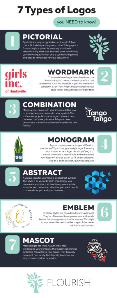
Seven Logo Styles:
- Pictorial
- Wordmark
- Combination
- Monogram
- Abstract
- Emblem
- Mascot
Before we dive into the seven types of logos, let’s go over the importance of taking the time to discover a logo style that best fits your organization. Colors, fonts, and imagery all tie into an impactful logo; therefore, you have to consider what resonates best with your audience, not just your own personal preference. In fact, 60% of consumers will avoid a brand with a logo they find odd, ugly, or unappealing. Therefore, establishing a recognizable, appealing logo is crucial for an organization’s success. Creating a logo that perfectly summarizes your company and its personality can be intimidating at first, but starting from the basics can help you decide which one is right for you!

Pictorial
A pictorial logo depicts a symbolic representation of your company’s services, mission, impact, etc. This graphic-focused style has the ability to evoke emotion while identifying your company at a glance. However, this style takes time for your audience to familiarize themselves with, so we don’t recommend this choice for a new brand.
We use our symbol often because we have become a recognized name in our community for our services. When you see the green Flourish tree, you know great things will follow!
Wordmark
Wordmark is a word-based style that leans heavily on the font choice. If you’re selecting this style, make sure you choose a font that mirrors your company’s essence. For example, a traditional company is most likely represented best by a classic serif font while a new and upcoming organization can be better represented by a modern sans serif font.
Girls Inc. of Huntsville, a local nonprofit organization, uses the wordmark style. With a bubbly, youthful font, their logo delivers a clear message with only text.
Combination
A combination logo is the best choice for a new business! It associates your company’s name with a design and establishes your brand’s personality. The merging of font and design symbolizes a service or product while attaching a name to it.
TangoTango uses a combination logo with a phone symbol encircling the company’s name. This is a great merging of icons, properly representing their mobile push-to-talk app.

Monogram
Too many words can clutter your logo. If your company has a lengthy name, the monogram-style logo is a perfect option. This logo style simplifies your lengthy name into identifiable initials, making it digestible to your consumers and audience. Additionally, this memorable logo can be condensed to fit on phone screens, business cards, and much more.
Solid Ground Counseling Center uses this style on its logo. Using their initials “SG”, helps the logo become easy to remember. Add the identifiability with the plant symbolizing growth and an arrow pointed to a confident future resonates with their target audience!
Abstract

The abstract type cultivates a logo that is uniquely yours. This style allows logo art to symbolize your company’s service, mission, or purpose in an aesthetically pleasing design. Similar to the pictorial style, abstract logos elicit emotion from your audience. For example, instead of scanning over them, consumers are likely to take a second look at abstract style logos.
New Edge Therapy uses a geometric pattern with icy colors, expressing their “cool” services. Additionally, their symbolic icon is reminiscent of a snowflake, a perfect reference to their cryotherapy services.
Emblem
Although the emblem logo is traditionally used by organizations and sports teams, it’s a great option for anyone. Similar to a seal or a crest, this style incorporates text and graphics into a shape. This style can be challenging to downsize, but there are always options to avoid it- such as a secondary logo variation.
Our friends at Quietdale Estate chose an emblem style for their logo. Quietdale’s logo uses a traditional serif font in addition to displaying their classic daffodils in a circular shape. This represents a playful but classic, modern effect.
Mascot
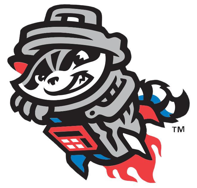
A mascot logo is an exaggerated design often associated with sports teams. Whether its intent is to intimidate competitors or represent a fan base, this style is fun and can be slightly eccentric. Mascot logos provide your brand with authenticity and typically incorporates elements of the organization.
Our favorite mascot logo belongs to our neighbors at Toyota Field, the Trash Pandas! Sprocket is a fun and family-friendly face, representing Huntsville’s home baseball team!
Regardless of which logo type you choose, remember to stay true to your brand image and refer back to your target audience. Your logo will be the first thing people see, the image people associate most with your brand, and a subtle way to communicate with your ideal consumer. Once you narrow down which style is for you, Flourish can help you with the design process! Our creative team has the skills to make your dream brand come to life. Contact us to discuss your creative strategy!

